Showing posts with label Wednesday Trends. Show all posts

Wednesday, November 13, 2013

Wednesday Trends--Starburst/Sunburst Design

I don't know about you but I have tons of paper pad scraps in my collection.  Today I'm sharing the hot trend of Starburst or sunburst patterns on cards and scrapbooking pages.  I've used it for this cute pup from the "Puppy Love" set for my card.


The technique may look complicated but is pretty simple and there are several ways you can use in on a card.  Just Google under either starburst or sunburst card and you'll see what I mean.
For my card I started with four 1.5" x 6" strips cut from my leftovers.  Each one of those strip was cut at a diagonal from corner to corner.  You will also need a base for assembling.  Just grab a simple piece of copy paper.  I cut mine a little smaller than A2 size because I knew I was going to  mat it, but if you want it to cover the whole front of your card cut it to that size.


Next you're going to start assembling the pattern.  I knew I was going to be adding a circle to the bottom left corner for my image so I traced the outside of my die so I could make sure everything else was completely covered with the strips.  I used a Two-way Glue pen to add a spot of glue just to help keep my pieces in place until I had them like I wanted them.


You can use whatever kind of adhesive you like.  I'm a liquid glue girl because of the humidity here in the south.  I used my brayer to get a nice smooth attachment.


Once all the pieces were glued down I trimmed the piece to get rid of the excess hangover.


Pop it on your card base and embellish as you want.  I added stitching to all my panels just cause I love to stitch on my cards, but it looks great either way.
Hope you have a great Wednesday.  I'll be back Friday with an Anything But a Card project to share.

Wednesday, November 6, 2013

Wednesday Trends - Distress Markers


Hi There She Goes fans! Sarah here to talk about a trend I love - coloring with Distress Markers from Ranger.

Like any form of watercoloring, using distress markers can give you a look from soft and subtle, to rich and vibrant. My first card today I was going for a softer look.


I LOVE the Sock Goblin line. They are so adorable, but best of all I love that the shading is cross hatched right on the image. It makes shading simple. I consider myself coloring challenged, so this is a big help!

I was hoping to make a video for you today, but I have a bad cold so that wouldn't really be fun for anyone! Luckily it's super simple, so here are a couple of photos.


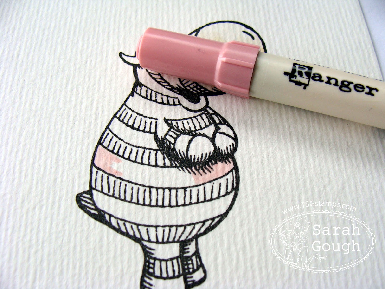
Stamp your image on watercolor paper. I'm using the adorable Wilbur. I like to use Brilliance Black ink, then heat set with a heat gun. I find I get a good impression with this ink. You can also use Stazon or archival ink, or use embossing powder to seal your image.

You'll also need a water brush or a thin paintbrush and water.


Scribble on some color where you want it to be darkest. I'm using Antique Linen here.


Use your brush to blend the color up to where you want it to be lightest (this is a really light color so it looks almost non existent here!)


When the paper is already wet, you can scribble on a non porous surface - I use a stamp block because I always have one on my desk - and pick the color up from there. I'm using Scattered Straw here.


Paint on the darker color. If you go over the line, or it bleeds a little, it's easy to fix...


Just scribble the color off your brush, and push the color back where it belongs. 99% of the time I can fix mistakes like this. It's important to remember to let each area dry before moving on to the next to avoid bleeding as much as possible.


I've colored the rest of the image the same way...


Where you want the darkest shadows, apply the marker directly to the wet area...


and blend. I'll often use a little unblended marker right where the shadow would be darkest.


I finished Wilbur using Spun Sugar, Worn Lipstick, Shabby Shutters and Peeled Paint markers.

Here's another card I colored using the same technique for our latest release using the fab Happy Fall.


For this card I went with more saturated color, and also created a bit of a glow around the image by outlining, then pulling outwards with my water brush. 


You'll notice the white highlights on the pumpkin - these were added with the Picket Fence marker, which has a great opaque ink.

You can definitely adapt this technique to other water based mediums - I have had good results with stampin' up! markers as well.


On this card I colored Amalia's Daisy the same way, using SU markers and LOTS of water to get the water stain look. You can really enhance that effect by wetting the image well, then quickly hitting with a heat gun to make it dry fast.

I hope you enjoyed this little look into an alternative to (amazing) copics, if you try it out, please let us know, we'd love to see!

Hugs,
Sarah

Wednesday, October 30, 2013

Sequin Love

Hello everyone!  It's Danielle popping in with one of my favorite trends right now: sequins!


I usually just use a few sequins as accents here and there but another one of my favorite uses is in shaker boxes!  So I mixed up some sequin soup (1 part various colors of sequins, 1 part micro beads, and a dash of glitter) and made a box using foam dimensional tape, card stock, and a piece of acetate.


I then pulled out the new Happy Fall stamp set (illustrated by me - shameless plug) and added a little image and matching sentiment.


And here is a picture of a recent card I made where I used a few white sequins to accent some snowflakes:

Thanks for stopping by and hope you are inspired to use a few sequins on your next project.

Wednesday, October 9, 2013

Distressing with Jenny


Hey there! Jenny, here with you today for a Wednesday Trend.  I have a fun trend/technique to share with you, that I happen to think is perfect for fall and Halloween projects! Distressing is honestly so much fun and easy to do, and fixes almost any imperfection (yes, I know, you're shocked that a seasoned stamper like me even makes mistakes ;) ). Smear an inky finger onto your image,  accidentally rip your patterned paper, or sew like you're legally blind? All can be fixed up with a little distressing!

I made what is possibly one of my FAVOURITE cards this year, or maybe even life, using this technique! OMG. This is the most handsome zombie on the block! 


Here are some details:
  • I coloured him up using my copics. Again, you are creating a distressed, or 'rough' looking project. No need to be perfect!
  • After copics, I went in with a black pastel pencil and 'dirtied' him up a wee bit more. And Oh My Heavens! Did you see the paper-pieced tie???? EEp!
  • I crumpled up the main image (trying to keep to the perimeter and away from the actual stamped image), flattened it back out, more or less, and then used my Distressed inks and a foam applicator tool to rub around the image. The folded marks will catch the ink and be more pronounced. I like that.
  • Now this next step is fun. I have a making memories distressing tool that I use to really rough up the edges, but you can also use your scissor blade and run it along the CS edge. And don't be afraid to get in there and actually rip spots. More is more. Ink up the torn edges so they don't look so stark white against the other sponged areas.
  • I did some machine stitching. Again, you don't want this to look perfect AT ALL. This is the perfect technique if you want to try machine sewing but are scared to death to have a runaway foot pedal. You cannot screw this up. Pedal to the metal, girls! The more crooked and out of control, the better the effect is. And leave your ends to just hang there! Snip your thread and call it a day.
  • See my DP there in the back? The one with all of the vintage ads? That was actually sitting in a little ball on my desk while I coloured the image. Uncrumple, smoosh down, ink, haphazardly sew down and you're done.
  • I also like to use twine when I'm distressing. Sometimes ribbon can look a little too polished for this wreckless style of card making. After all, my card looks like it was just pulled out of a house fire. Gorgeous satin or grosgrain ribbon would not fit the theme. I used a natural jute twine here, that is quite 'hairy'. Perfect.
  • OMGosh- one more detail I need to point out- THE BRAIN! I love it!!! This brain isn't so fresh. It's got some necrosis.....I also added a nice layer of crystal effects to shine it up and add to the creepy factor. Same with the bone sticking out of that waxy hand! I just love the macabre!
  • I felt like the card wasn't quite done, so I did add some of those new, trendy enamel dots, which I think cost an arm (pun intended) and a leg, so you want to be somewhat frugal. But they are nice, so I forked out and got a few packs.


Here is the link to the new set I used- No Tricks, Only Treats. This is a fabulous set, trust me, you need it. Go now and buy it, you won't be sorry! Thanks for sticking with me! And as always, Happy Hump Day!


Wednesday, October 2, 2013

Wednesday Trends - Silhouette Cut Files

Tangii here with this week's Wednesday Trend!  Did you know TSG sells Silhouette Cut files that coordinate with our sets?  Not only are these UBER affordable, but they can make quick work of some detailed cutting!  If you hopped around during Peek Week, you may remember seeing this Halloween goodie bag I made using the NEW Halloween Tags set, today we're going to use the Halloween Tags Silhouette Cut Files as well as the stamp set to make a set of 4 tags... quick and easy!!

I've started out with a basic "Tag" shape that I already had in my Silhouette library.  When you purchase the Halloween Tags Silhouette Cut File ($1.50), it comes with a SMALL version (these are the pieces you stamp on once cut) as well as a LARGE version (these are intended for "matting").

Here I have taken all of the shapes I want to cut out as well as their "mat" pieces and layed them out on the tags... I'm a visual person.  Now I'll break these up and cut the pieces out.  

Here are all of my pieces!  tags, mats and shapes ready to be stamped!  I decided to cut my shapes out of white so that I could color them, but you could certainly cut them out of colored cs and then stamp in black, etc.  Because the stamps are clear you can easily get your stamps right where you want them even with the pieces cut.  I do recommend using a piece of black cardstock under your stamping just to help ya see better.  This is also probably a good time to tell you that I'm 'blind in one eye and can't see out of the other', so if I can stamp these fairly easily yall should be able to no problem ;)

Voila!  Here are my finished tags ready to be added to the front of some goodie bags.  To be honest if it weren't for the Silhouette Cut files, these tags would have been MUCH more plain (or more likely, non-existent)!  

Here you can see the label and the pumpkin are popped up from the tag.  The best thing about using these Cut Files is it's just as easy to make 4 different tags as it would be to make 4 of the same... let the machine do the tedious work for me?  Works for me!!  Thanks for popping by for my Wednesday Trend, if you'd like to see some better pics of each of the tags, feel free to visit this post on my blog.

Wednesday, August 14, 2013

Wednesday Trends - Non-focal Images


Hi, everyone! Heather P. here posting this week's Wednesday Trend... One of my favorite things to do is to take the smaller, non-focal images within a set and find ways to turn them into the stars of the show! :) I think it's a really fun way to get a lot of mileage out of each set, and a lot of times these cards end up being my favorite.

There are SO many amazing girls on this DT who can really kick it out of the park when coloring images.  I mean seriously, look at any of the projects created during release or as part of the week in review threads, and you can't help but be blown away by the talent on this team.  Coloring is *not* my strong suit, so rather than embarrass myself (ha!!) I leave the coloring to the experts and try to approach the stamp sets from a different angle.


Case in point? The fun little card I created for today's post using the Aquaholic set.  I'd say the main images in this set are the darling children and their beach accessories, but I can't help but be drawn to the adorable little fish!


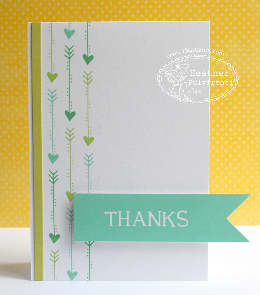
In previous releases, I've also been drawn to other non-focal images, such as the arrows in the School Doodles set:


Or the woodgrain hearts from Pandamonium:


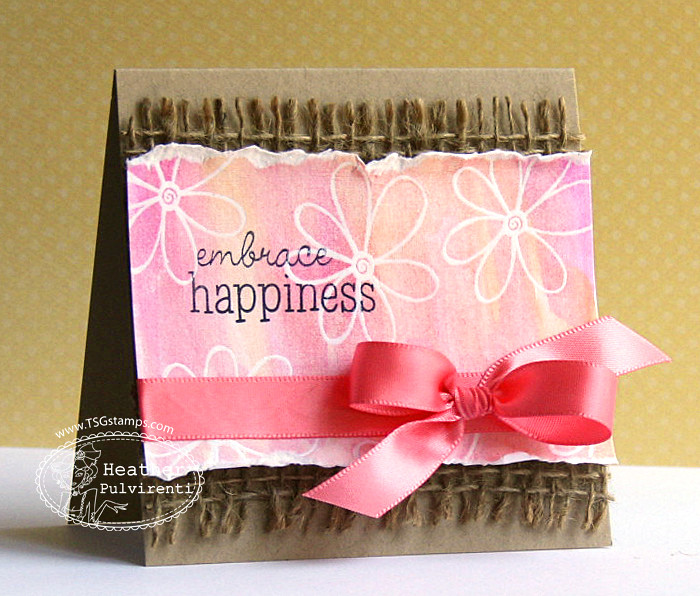
The flowers from Amalia's Daisy:


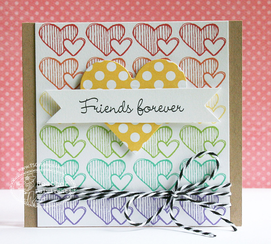
Or even the overlaid hearts from Ginger:


It's really a lot of fun, and I hope that if it's not something you're already doing, it's something you'll try! :)


Wednesday, August 7, 2013

Wednesday Trends - Nautical!

Hi there! Sarah here to talk about a BIG trend happening lately, nautical!

Nautical is everywhere right now - fashion, decorating and definitely paper crafting. Think navy, red, crisp white and pops of yellow with stripes, anchors and banners and you are SO on trend. Here's a little collage I put together from my nautical pinterest board:


Feeling inspired? Good! There She Goes has a bunch of sets perfect for this trend, Aquaholic, Float my Boat and Shiver me Timbers just to name a few.

My first card today uses Shiver Me Timbers.


For this card I took advantage of one of the many nautical paper collections out there at the moment. This one is Down by the Shore by Echo Park.  I like to add natural fibers on my nautical cards, I'll admit - I tried to tie a sailors knot, and failed miserably (multiple times) so went with a knot and button combo instead.


I love that pirate image! I coloured with copics and fussy cut right on the edges to create a simple scene.

I like to finish off the inside of my cards, it's a great way to use up all those leftover paper scraps! Here's the inside of this card:


Don't have enough paper to cover the inside of your card? Combine them! Here I used the leftover anchor paper and tacked on some stripes to make the piece big enough.

The great thing about this trend is it is so easy to achieve the look without any special papers. For my next card, I went clean and simple and I just love the crisp, fresh look!


I cut strips of navy card stock and adhered them to a white card base - if you start with the middle strip, it's much easier to get your spacing perfect. I die cut a red frame (reminiscent of a porthole) and stamped the awesome sentiments from Handwritten on a banner shape.


You don't have to use ocean themed stamps on a nautical card - I think this is a great uni-sex look for a thank you card. I finished the card with a little charm I found in my stash, hanging from some thick hemp twine.

Thanks for stopping by today, I hope you're inspired to add a little nautical interest to your next creation!

Wednesday, July 31, 2013

Wednesday Trends- Chalkboard

Hey there! Jenny here, with some fun cards to show you that focus on one of the current trends in cardmaking (I think! I am not super-trendy, so I am hoping I am still one of the 'in kids' with this! lol). 

There she goes has some really great sets that would work well with this technique (I am dying to try the new School Doodles with a chalkboard look!). Don't limit yourself to sets that are made specifically for this look, because you can achieve similar effects with lots of different stamps! Anything 'doodle-y' would be perfect! Imperfect lines are the best.

That being said, there is one particular stamp set that you NEED if you like this look! It's Chalkboard Memories and it ROCKS! It's easy to work with and achieves stunning results! It even has a little chalkboard image, which you'll see in my first card....


I stamped the chalkboard onto X-press blending card and coloured it with my copics. I went old-school and coloured the board green, as they were in my day :) I then stamped one of the wicked awesome sentiments in white craft ink directly onto the copic colouring (you DO NOT want to screw this part up, since you just spent who-knows-how-many-minutes colouring the image!!!). I then heat embossed with white powder. Cute, huh? So there is one look for you.

Look at the little eraser and chalk! Brings me back to my school days! Anyone ever have to stay in at recess to clean eraser's and chamois'?? Yeah, me neither ;)


Up next I've made a masculine birthday card, using white embossing and ink on black CS. This seems to be more the 'norm' in the chalkboard trend, rather than colouring your own board ;)


I used the same set: Chalkboard Memories, stamping it first in white craft ink and embossing with white powder, and then stamping again, just offset. It renders a very subtle shadow, but in real life is a nice touch! The next thing I do, is to use the pad of your fingertip and smudge white ink all over. Messy is good. There is no 'right way' to do this. Just go bananas and have fun!

I used the same die set that I cut out the black CS, to make a little wooden frame (woodgrain DP) and popped it up with foam dots. Brads, jute and a bow-tie die make this a perfect card for the man in your life!


I'm going to show you one last card that is from awhile back, when we released this set, so you may have seen it before~ But I just loved this one (I gave it to my MIL-she's a retired teacher), so I couldn't resist showing it off again!


Apple shaped chalkboard~ Eek!!!


Okee-dokee~ that's it for me! I hope that I have helped to inspire you to try this technique if you haven't. And if you have, then do it again, cuz it's just plain FUN!!